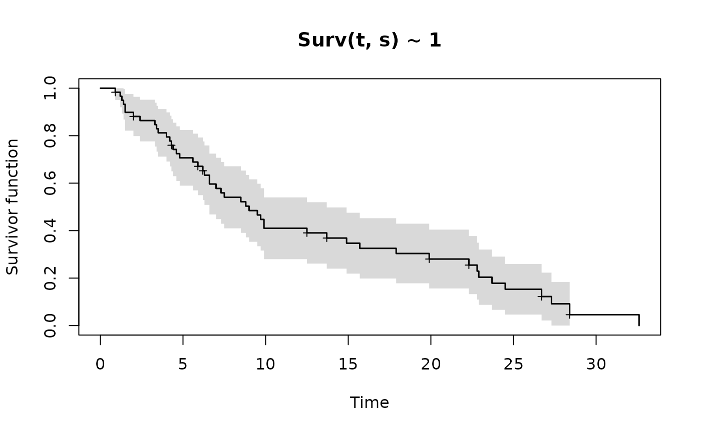
Base graphics, drawn from the tables the estimators already return, so no plotting dependency is needed. Censored times are marked, a band is drawn where a standard error is available, and groups get a legend.
Usage
# S3 method for class 'tda_ple'
plot(
  x,
  conf.int = TRUE,
  mark.censored = TRUE,
  col = NULL,
  lty = 1,
  lwd = 1.5,
  xlab = "Time",
  ylab = "Survivor function",
  main = NULL,
  legend = TRUE,
  ylim = c(0, 1),
  ...
)

# S3 method for class 'tda_ltb'
plot(x, ...)

# S3 method for class 'tda_rate'
plot(
  x,
  what = c("survivor", "rate", "density"),
  xlab = "Time",
  ylab = NULL,
  col = "black",
  lwd = 1.5,
  main = NULL,
  ...
)
Arguments
- x
an estimate from
tda_km,tda_ple,tda_ltb, or a fit fromtda_rate.- conf.int
draw a band at plus or minus 1.96 standard errors.
- mark.censored
mark censoring times with a cross.
- col, lty, lwd
colour, line type and width, recycled over groups.
- xlab, ylab, main, ylim
as usual.
- legend
draw a legend when there is more than one group.
- ...
passed to
plot.- what
for a fitted rate model, which of the survivor, rate or density curves to draw. The fit must have been made with
prate.